Artist Talk: Award-winning Dutch photographer, Bas Princen
Coming to the Architect Association School of Architecture to see a photographer talk about his work, one must ask what is the correlation between photography and Architecture. Ben Princen is a trained architect, but now most of his exhibited works are photographs of landscapes and buildings from all over the world, such as China, Egypt, America, and Europe. His illustrated booklet, Reservoir, contain a series of theses photographs of which coveys the oddity of human ‘civilisations.’
During the talk, Princen displayed on PowerPoint the pictures featured in the book. He was able to tell us the stories behind some of his pictures. This picture below, Mokattam ridge (garbage city) from Cairo has two vanishing points. This is picture is actually two pictures that are fused together to create a story. He noted that every picture tells a story, and the photographer directs the viewer to follow the narrative.
The eye first enters the photo some where in the middle where the flat roofs are seen wholesomely. It then travels around in a circle, up to the white abyss, following the horizon line, and back down to the frontal view avoiding the dark black hole right in the middle of the picture. Light plays a role in directing the eye. The lilted parts are where the eyes forces in on. The dark parts and the white background become the negative space that borders the path that the eyes travel on.
This garbage city juxtaposed to the white background conveys the dramatic difference in social classes in Cairo. Patches of light and darkness through out the picture is similar the current state of Cairo. When I went, my friend would point to one place and say this is one of the nicest parts of Cairo. Then I see very broken down building next to it. All over Cairo, there are districts of wealth adjacent to dodgy areas.
Mokattam ridge (garbage city), Caïro, 65×81 of 125×155 cm,2009
Other photographs in his series follow a certain sequence. The viewers can see more clearly of order of photos at artist talk, where he projects his photography in a certain order or by flipping through his book. A gallery space does not hold the same emphasize to order because the viewer is exposed to the multiple images at the same time. By presenting the photos one by one, the viewers can see the slow transition from one image to another, which is vital to Princen’s work to see the references from old photos.
From these white man-made colonnade, he gives us the following picture. Here he juxtapose two ideas of strength, human’s contraction of beams and nature’s strong earthly material; both supporting one another. It is a striking contrast between organic and geometric shapes, but that is what makes it beautiful.
Princen’s references come from different photos from other photos he took or old photos from books and magazines. Princen said, “I go out to find photographs […] in which the artificial and the natural take each other’s forms and in which one is unable to see if things are being constructed or destroyed. I think that is the most interesting thing that can be said right now about the cities in which we live, and the landscapes in which we dwell (and vice versa).” His interest is the fusion of nature and humanity, and how they work together and live with each other. If nature and humanity can live together so well and ideally, they can dissolve within each other. Like in the top photo, the horizon line from the landscape continues on the gilded building in the middle of the photo. Looking at it for a long period of time, the building begins to disappear. Nature represented by landscape, and buildings represented by building structures, they both sit in harmony within each other, in Princen’s photos.
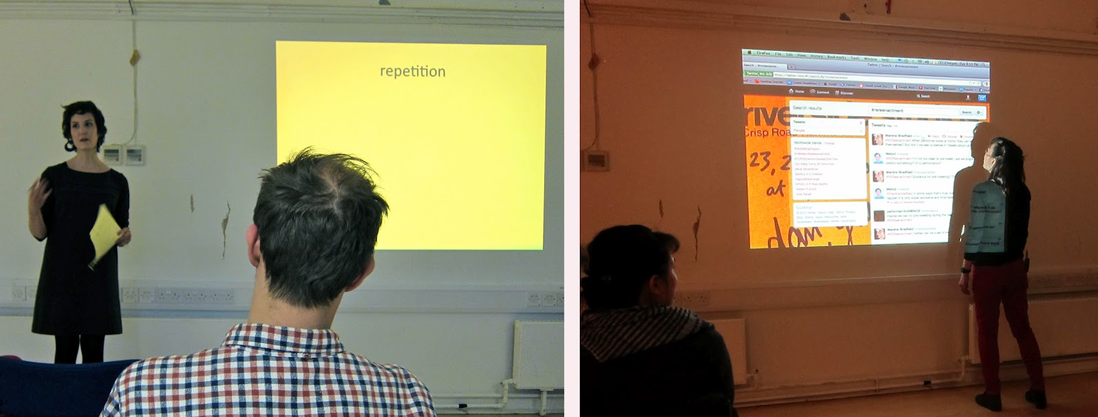
With joint collaboration between Royal College of Art and the London Consortium, Metalab presents a performer/audience/re-enactment by Dan Graham. The piece was originally done at the London performance site Riverside Studios, titled performer/audience/mirror in 1979.
There were 4 stages of this performance. In stage one, Graham stands in front of the audience describing everything about his external presence and his body in the space. During stage two, he describes the audience’s external actions and behavior. In stages three and four, he turns to the mirror that reflected the whole room with the audience and repeats stages one and two.
Dan Graham in his performance
Graham was interested in the real time behavior and relationship between the performer, audience, and mirror. When Graham turned to the mirror, ” the audience was able to instantaneously perceive itself as a public mass (as a unity), offsetting its definition by the performer(‘s discourse). First, a person in the audience sees himself “objectively” (“subjectively”) perceived by himself, next he hears himself described “objectively” (“subjectively”) in terms of the performer’s perception.” [1]
At the Metalab, the audience helped re-enact stages one and two just as Graham did. This time, however, we switched the place of the mirror with a projection of a Twitter page. Anyone was allowed to “tweet” with their phones, which would show up on the page. There was a computer at the back of the room for anyone to use. There was a person constantly refreshing the page so that all the tweets would be seen. Because Twitter claims to keep people updated on “what’s happening, right now, with the people and organizations you care about,” as stated on their Welcome to Twitter page, we experimented with how Twitter can reflect real time as the mirror did in Graham’s performance.
photos by Marsha Bradfield At the Riverside Studio
I volunteered myself to be Graham in this re-enactment. As I stood in front of the audience and described myself externally for stage one, it was quite nerve racking. It is hard to talk about nothing and only describing the slight details of my actions, which are often unnoticed and unintentional, only details that Sherlock Holmes would catch. During stage two, I described the audience. Amongst the audience, were my friends and my professor Dr. Mary Robert, who brought me to the performance. As I looked into the audience, I described the movements happening in the audience. Graham pointed out that there was always a slight delay between the audience’s actions and his own descriptions of what they were doing. I also experienced this.
That delay was further displayed in stages three and four when I turned towards the Twitter feed. Stage three was difficult to describe myself while looking at the Twitter page. I just had to describe where my eyes were looking and where I was physically standing. The concept was to see myself through the Tweeter feed, however, it was difficult to read myself on the page. It might have worked better if it was my own page where I try to express myself and my taste in the background color and font choices.
In the forth stage, I had to describe the audience through reading the tweets. It was very different from the mirror because I had to take time to read the tweets first, the audience had to take time to type and post the tweet, and the page had to be refreshed in order for the tweets to shows up. We also had a smaller crowed so there weren’t many tweeters.
Our discussion at the end of the re-enactment focused on the similarities and differences between the mirror and Twitter. It is interesting to realize how Twitter is far from the live truth. A mirror reflects objectively what ever faces it. A tweet reflects the writer through what the writer wants to write about. The writer can choose to omit or highlight something unlike the mirror, which shows things exactly how they are.
The other concern is the issue of “right now.” In the mirror, it reflects everything as the action is being done. When an audience member raises his hand, his hand is raised in the mirror at the same time. Then when Graham described the raising of the hand, there is a bit of a delay because Graham has to see it, register it in his brain, then talk about it.
To some degree there is some subjectivity in Graham’s monologue because he can choose what to describe and how to describe it. Twitter on the other hand, more time takes place in between when the audience tweets and when I described it. It is not “right now” as it is in the mirror. For instant, an audience tweets, “I agree with what you said.” Moments have past, and I have already changed topic. The tweet is no longer relevant, and it becomes confusing.
When you are sitting in a room, tweeting about people in the same room feels ridiculous because Twitter does not fulfill its promise to announce what is happening “now.” Twitter does change in perspective if the audience member were at different locations around the world. In that case, Twitter and technology can showcase how fast news can travel with a click of a button.
This just reminds me of that one scene inDisney/Pixar film, WALL-E (2008). In the film, a future society where technology runs the lives of people and they no longer have to make any efforts to live. Walking, talking, eating, was done on their behalf by different forms of technology. In this one particular scene, an overweight man converses with a friend through a virtual scene, like Skype, while sitting on his floating wheelchair and eating burgers as a milkshake. Then the we see the bigger picture, and the friend that he was talking to is sitting right next to him, but he is too lazy to turn his head and would much rather converse with him through the technology provided.
If we wisely utilize the technology provided today, we can reach a broader audience around the world at the same time which is incredible. However, this “headphone” generation must understand that Twitter, Facebook, Tumblr, and other social networking sites can never compare to the real time experience that is physically present in front of them.
Mondrian and Nicholson in Parallel, opening at the Courtauld Gallery at Somerset House
Courtauld Gallery at Somerset House featured the early 20th century works of British painter Ben Nicholson and Dutch painter Piet Mondrian. Nicholson and Mondrian’s works are displayed side-by-side illustrating their relationship and the influence they had upon each other’s art.
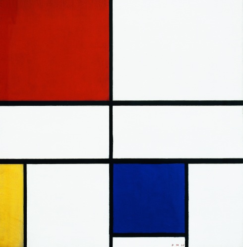
Piet Mondrian, Composition C (no. III), with Red, Yellow and Blue, 1935. Image courtesy of Mondrian/Holtzman Trust and via http://www.courtauld.ac.uk.
Mondrian is best know for his black, white, and primary color compositions. Composition C (no.III) from 1935 strips the canvas of small details and narrows down to the basics. Black parallel and perpendicular lines, are laid upon a white canvas. Mondrian explores the spatial relationships with the addition of vibrant colors.
Clement Greenberg, an American writer who had a lot of influence in the art world, described Modern Art as a movement that called attention to the actual art medium with little narrative and little attention to the subject of the painting. Like other Modern artists, Mondrian’s abstract painting is an experiment in the medium of paint and how it effects the viewer.
Nicholoson’s relationship with Mondrian first began when he visited Mondrian’s studio in Paris in 1934. After an overwhelming experience, he actually had to rest in a nearby cafe to take it all in. The two men continued their relationship after Mondrian moved to London during WWII. During those seven years living in London, his neighbor Nicholoson and Mondrian built a strong relationship dispute their 22 years age difference. They kept their friendship even after they were geographically separated until the death of Mondrian. Mondrian moved to Manhattan, New York, and Nicholoson moved to St Ives, Cornwall.
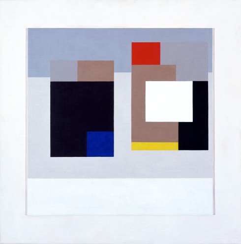
It is easy to see the artistic parallel between Mondrian’s Composition C and Nicholson’s untitled painting from 1940 (above), though these paintings were produced when the two artists were apart. Thanks to the curators of the Courtauld Gallery, we can see that both paintings followed a simple, straight, grid-like pattern in their compositions. Mondrian’s, however, described the energy and vibrance of the colors used by juxtoposing bright colors. Nicholson, on the other hand, introduced different tones of colors that Mondrian does not explore. Nicholson has no lines in between his different colored spaces which emphasize the power of different tones and saturation which have no need for defining boarders.
This exhibition celebrated the benefits of artists’ relationship with one another over a long period of time. The artistic theories and language shared between two artists inspired each one to uncover different artistic theory that we now can enjoy and learn from.
The exhibition also invited The Joshua Jaswon quartet from the Guildhall School of Music and Drama. The group played music by Lester Young, Duke Ellington and Charlie Parker. The public was encouraged to come dressed in 1930’s glamour to grain free entrance. Of course I could not resist getting my hair and make up done, and dressing up in a floor length dress and fur.
The curators of the Courtauld Gallery are telling a story of friendship that transcends lifetimes. Iron sharpens iron, just as a friend inspires another friend to strive for more in life and art.
Two is better than one, as the saying goes, and through experience I have seen the the benefits of good company. One thing I can boast about is how blessed I am to have amazing and supportive friends. One friend who accompanied me to the gallery opening, is a young lady that I admire and feel comfortable sharing my thoughts and ideas about how to live life. Vice versa, she can do the same with me.
In front of Somerset House dressed in 1930's Glamour
The art of making friends: finding someone that possesses a kind of aura or characteristic that you, yourself want to gain or understand. Then spend time with them in hopes that some it will rub off on you. That is what Nicholoson did when he invited Mondrian to live in London. The result of that invitation has stretched beyond their lifetime, and we celebrate it now at this gallery.
I first fell in love with the Phantom of the Opera in middle school band. We did a number compiling the best of Andrew Lloyd Webber’s works, including what was arguably his most famous composition, Phantom of Opera. I remember playing the Timpani, and in-between my drum rolls, I would sway to the music with the pallets in my hands, completely enchanted by the vast number of instruments playing. For this particular concert, the symphony band and the string orchestra collaborated and played together. Even from a middle school band with 13 year-old musicians, the multiple layers of sound produced by the different instrument was phenomenal. The post below is not of us playing, but it is so magnificent to see a performance as such. And being a percussionist at the back of the band, I could see the musicians as a whole while being surrounded and embraced by such beautiful sound. We had an opportunity to experience a glimpse of Lloyd Webber’s masterpiece, and it was glorious.
Then in 2004, Lloyd Webber and Joel Schumacher produce the film adaptation with Emmy Rossum as Christine and Gerard Butler as the Phantom. One of my older friends, more like a big sister, took me to go see it in the movie theater. When the DVD was released, I had it on repeat just for the music to fill the house. My phone’s ringtone was the Overture for a long time. I remember going out on my first few dates. When my Asian mother called, the intense, demanding, and haunting music scared my date. Needless to say, it kept him on his toes.
I finally saw the musical in theatre when I was in New York. We paid the last minute, student, price to sit in the nose-bleed section, but it was still an amazing experience to hear the music for what it was initially composed for, a musical. In the scene when Christine walks through the mirror following the Phantom down the dungeon, the organ plays, Dun, dun dun dun dun dun. I nudged my friend with a load whisper, “This is it! This is it!”
Majestic Theater in New York
I had a chance to see this epic romantic musical again in Her Majesty Theatre in London. It could never grow old for me. The featured song, Phantom of the Opera, has this rocking roll beat, boom – boom boom- tick, Boom – boom boom- tick, while the female vocalist stretches her voice to a higher and higher octave. As she climbs the scale, the male vocalist serves as a strong bass that compliments her voice. This beautiful harmony is supported by the brass section of the band whom brazzingly announce the significance of the moment when Christine meets the Phantom, and the string instruments that provide a mystifying element to what seems to be an angelic moment. The organ reminds us that this is in fact a “strange duet” between a ghost and a fanciful young girl. Webber’s genius is his ability to translate the mood and feeling of the story into the notes and lines of the music score.
The story itself is no more than a romantic chick-flick, a gothic fantasy about girl, at the start of her stardom. She has not one but two suitors. One is her childhood sweetheart, who also just so happens to be a rich Viscount. He is the charming gentleman, Raul, that will take care of her, come to her rescue riding bareback on a white horse, and sword fight to defend her. On the other hand, she has a deformed genius that secretly plays as the architect, composer, and mastermind of the opera house. The Phantom appeals to her dangerous, bad boy fascination . He is mysterious, talented, and yet pitiful. What I find interesting is that in the original book written by Gaston Leroux, there is more focus on phantom’s story. In fact, in the musical, there is no actual mention of his real name, Eric. The musical’s main character is Christine. It is written to showcase Sarah Brightman, who is the original female lead, and Andrew Lloyd Webber’s former wife. It is their divorce that postponed the movie 10-15 years later. Of course that is never publicly stated.
Michael Crawford and Sarah Brightman in the original 1986 production of The Phantom of the Opera. Photograph: Donald Cooper/Rex Features
Sarah Brightman did not get a chance to play her role in movie. Schumacher, the director, wanted to appeal to a younger audience, privy to Christine’s innocent and naïve character. 16 year old, Emmy Rossum’s voice was beautiful in the movie despite the pressure. Her acting was par, but Brighman’s acting was par as well. It is hard to find an extraordinary singer who is also an extraordinary actor. As for the character of Christine, the actress only had to look helpless or in love.
The other very large shoes that had to filled, was the role of the Phantom. Gerard Butler was not a trained singer, therefore, he had a rough and raw rock-n-roll feature in his voice. Some would consider blasphemy that I make this statement, however, Butler played an even better role of the phantom than Michal Crawford, the original Phantom. Crawford’s Phantom is a sleazy and creepy “creature of darkness.” Butler has the rough masculine voice that adds to the typical female bad-boy fantasy. The audience can then understand why Christine is enchanted by the idea of Phantom.
In Point of No Return, Butler’s Phantom growls over the note as Christine is slowly giving in to him. The audience does so too, especially in this song, with the most eloquent lyric about making love, “entwining” bodies, and the “sleeping bud burst into bloom.” Unlike Crawford, Butler adds a roar to the “raging fire shall flood the soul.” It is quite surprising, as a grown person revisiting familiar song, to understand what they are singing about when they sing, “When will the blood begin to race? What rich desire unlocks its door? What sweet deduction lines before us?” The set and custom for this scene is seductively red and black. In the movie, there is a tango in the background that the play does not have.
There are a number of limits to what can be seen on the stage of a theatre. In the movie we can see the set in its entirety. On the theatre stage however, we can appreciate the wise use of space that the designers so craftily planned. The masquerade scene on stage was asymmetrical, conveying the large scale of the opera house without having to complete the whole staircase. The set designers left the rest to the imagination. In another scene, after Christine is debuted on her first show, the stage is flipped. The audience sees the back of Christine as she bows towards an actor that plays the conductor, and behind him, a black screen that conveys an audience. A curtain closes, and her ballerina friends run to congratulate her. This was a cleaver stage trick that invites the audience to see the behind the scene production side of the opera house.
Masquerade Scene on the Staircase on Stage
Staircase in the entrance hall of the Opera House in Paris
This play is about a play of plays, so it was fun to see the production of the play as part of the play, making the audience feel included in mystery of the phantom of the opera house. I did get a chance to walk in the real Opera de Paris Garnier, where the story takes place. Charles Garnier for the Emperor Napoleon III built this gilded baroque theatre in the 1860s. I did not get to see the water canal underneath the opera house, but it does exist due to Garner’s construction. I saw where the famous chandelier hangs. On 20 May 1896, one of the counterweight of the chandelier fell and killed an audience member. We cannot confirm or deny that was the workings of the Phantom; however, this was the story that inspired Gaston Leroux to write the book.
Raeda Saadeh’s photography series, True Tales, Fairy Tales alludes to popular folk tales and fairy tales that display her deep conflict of identity. Her photo series includes Rapunzel (2010), Penelope (2010), and Little Red Riding Hood (2010). Like the fairy tales, her photos appear to be flowery, simple, and shallow childhood bedtime stories. The irony, however, is the deeper and darker meaning beneath the photo, allowing her photos to be witty as well as poignant.
In Cinderella (2010), Saadeh models in her own photograph on the ground just after a fall, wearing a renaissance, pink ball gown with puffy sleeves and a tiara on her head. She sets this scene in front of golden stone houses with stoned steps and old-fashion light fixtures that lights the streets. As she looks back behind her, her eyes acknowledge the danger that chases her. Saadeh carefully chooses this moment in the tale when Cinderella is anxiously running from the royal ball just before the clock strikes midnight. She is in-between the taste of a better life and the fear of getting caught in her ragged dress, her mice and her pumpkin. Going to the ball and dancing with the Prince was the height of her life thus far in the story, but she had to escape that lifestyle in the middle of the night because she is unable to change who she is or the social status she was born into.
Saadeh actually took this photo at 4 am on the street called Jaffa, where wealthy Palestinians lived before fleeing the city in the dark hours of the night during the 1936-1939 Arab Revolt in Palestine. Jaffa was at its height with a strong economy, but residence there had to flee from that lifestyle because they were Palestinian Muslims in a Jewish country, something that is out of their hands and cannot control.
Representing the Muslim Palestinian community, she has a unique and contradicting position living in Jerusalem with an Israeli passport. She was born in Umm Al Fahem, Palestine. Then she achieved her BFA and MFA at Bezalel Academy of Arts and Design in Jerusalem. She “personifies the absurdity of the Israeli-Palestinian conflict,”[1] and embodies both opposite identity and culture whether she likes it or not. She associates herself with the Islamic Palestinian community through her family and her belief system. On the other hand, she is living in a Jewish country; studying and working side by side with those who have opposing religious and cultural beliefs system. In her work, she illustrates this position at a Crossroads (2003), in which she models herself in the photo, standing outside a door with a suitcase ready to leave, yet she is grounded by a cement block fashioned to one foot.
The title, Crossroads, implies her journey in life where she is conflicted to choose two different directions: to be a Palestinian and to be an Israeli; to defend her belief and her heritage while being civil within the Jewish community. This photo conveys this rising generation deciding how to choose, at a crossroad, between two extreme views to find a way to resolve this conflict. The problem is that they are not free to go wherever, there are grounded by their own heritage and beliefs, like the cement block on her foot.
Japanese artist Hisaji Hara, like many photographers, find inspirations from paintings for their photos. At Michael Hoppen Gallery, Hara display his photos all based on French-Polish painter, Balthus’ work. Most of his paintings are of young girls, and though he claims that his work are not erotic, viewers can evaluate for themselves when they see Guitar Lesson, where he paints older women holding a girl like a guitar playing with her private parts which are exposed in the painting.
Hara left that particular painting alone, but he mimics many other paintings with his own photography. Hara recreates Balthus’ painting using Japanese girls stage-set in a private medical building. This building that he photographed was used in the 1940s, and since then it has left a ghostly, empty, and uncanny feeling. Furthermore, Hara utilizes smoke machines and special photography techniques to extend the depth of field, creating a more hollow space.
Like Balthus, Hara prefer using young girls rather than women to preserve the timeless, strange and awkward stage of adolescence. The subjects in the photos are of real people posing in the same positions and placements as the subjects in Balthus’s paintings. Hara adds a Japanese spin to his work, having his subjects dress in Japanese school uniforms. He brings life to Balthus’ two-dimensional painting, recreating the artist’s vision via a three dimensional medium. Ultimately, the final production is reconstructed as a two-dimensional photograph framed and hung on the wall. His did, however, master the technique of accentuating the depth of field; thus, adding another haunting surface.
Michael Raedecker is a Dutch artist living and working in London currently, after studying at Rijksakademie van Beeldende Kunsten in Amsterdam and Goldsmiths College in London. Known for being very muted and subdued, his paintings hangs upon the three white walls of the single room gallery at the Hauser & Wirth gallery. There is barley anything in the interior with exception of his work on the three walls. The hung paintings themselves hold no exciting color or dynamic contrast. Most are monochromatic with washed out paint, running and dripping down. At first glance, this series of paintings are boring until a closer glaze when the viewer can discover multiple layers of the piece.
Raedecker has the ability to direct the eye into the direction of his choosing through his perspective drawings. The major theme of his pieces is cabin houses on large painted canvases. Like an architectural sketch, Raedecker’s houses are simple lines connected at a viewpoint on a horizon line to create an illusion of perspective and 3-dimensional space on a two dimensional surface of the canvas. He adds another sense of dimension with the texture of the embroidery over and under the paint. Unlike Farhad Ahrarnia’s embroidery paintings, Raedecker focuse on the texture attribute of the painting rather than the color. Raedecker also makes the thread draw to create the image, rather than Ahrarnia who adds the embroidery on top of the image, and Ahrarnia does not use paint.
Monument, 2011
Acrylic and thread on canvas
Looking closer Raedecker’s pieces, many layers appear. Raedecker sometimes leaves the pencil marks he started with. The lines are sometimes painted or embroidered with thread. From afar, the thread cannot be distinguished from a paint stroke or pencil mark. He blends the mediums by overlaying them on top of each other and use only one color.
Similarly, he blends two design disciplines together, architecture and fine art. The clear cut lines that forms the image of the houses are no different from the lines drawn on a drafting board. Raedecker takes what was drawn on the drafting board and puts it on a canvas. He the runs over it with paint and embroidery. Some of the threads are painted over, and some are laid on top of the paint crating more texture on the canvas surface. Unlike traditional drawings, He cuts the canvas into sections stitching it back in a different order. He interrupts the expectation of the viewers and makes the viewers see the one painting in pieces calling attention to the beauty in the details rather than the piece as a whole. He also varies in other themes, branching out in random object like wedding cakes, chandeliers, and windows. The vast negative space in his painting highlights the simplistic nostalgia feeling even with the lack of many colors.
John Hutchinson, director of Douglas Hyde Gallery in Dublin, points out the feminist themes among Raedecker’s pieces and the method of stitching and embroidery also suggest feminism to express a “weary longing for comfort and intimacy—perhaps the desire for a tender embrace or a mother’s touch.”[1]Supply (2011) and Monument (2011) his wedding cake pieces, and his chandelier piece, Scheme (2012) gave the same eerie motherly feeling that of Miss Havasham in Charles Dickens’s book, Great Expectations. The same fade beauty and dusty fine furniture only give the allusions of luxury yet leaves a question of comfort.
[1] John Hutchinson, “Michael Raedecker,” Camdon Art Center, May 2009.
Down the street, we walked to the National Art Library located in the Victoria and Albert Museum. This is not the ordinary library. Books cannot be checked out but can be requested for reading within the facility. The facility itself is very charming and gorgeous but haunting in a way. With some added cobwebs, it could be a haunted mansion. The reliefs boarding the bookshelves, the golden Victorian chandlers, and moss-green cracking walls next to the dark oak furniture embraces the visitors to the 1850s when it was built. Like walking into Grandpa’s reading room, the library command seriousness and respect, while basking in its glorious interior.
We registered before coming to the library to see and experience this emerging type of art. In the 1960’s book art or artists’ book, arises due to the “heightened social consciousness, the immense popularity of paperback books, a new awareness of how art (especially the costly “precious objects’) can be used as a commodity by a capitalist society.”[1] Lucy Lippard is a known writer, activist, and curator relating to art for social activist and one of the founders of Printed Matter in New York. She describes book art is not an art book with collected copies of different art works, nor is it a book on art with artists’ writings of critics and analysis; “the artists’ book is art on its own, conceived specifically for the book form and often published by the artist him/herself.”[2] It can be more visual than textual and can vary in forms of printing, folding, and production of the book art. It, however, remains some characteristic of that of a book, which holds true to its name, book art.
The first of book art can be directed to Ed Ruscha, an American artist, and his publication of “Twenty-Six Gasoline Stations” in 1962[3]. As it states in the title, the book contains twenty-six pictures of different gasoline stations that Ruscha drove by on his road trip on Route 66 from Oklahoma to Los Angeles, California. The book holds no significant order and holds no pedantic text. This book was mass produce and priced about the same as a movie ticket of that time, so that anyone could purchase his art. What Ruscha tried to accomplish is to make art something that belongs and dwells with the average citizens and not just in the private collections of the elites. Through the format of a book, Ruscha and other book artists “provide a more intimate communication than a conventional art object, and a chance for the viewer to take something home.”[4] It forces the viewers to take hold of the book, interact with it, and flip through it. Book art levels the social classes of people that limits to those who can touch conventional art and can see conventional art. It is a “rebellion against the increasing elitism of the art word and its planned obsolescence.”[5]
His democratic efforts are in making art affordable, accessible, and portable for the general public. “Rather than reaching a broader audience and effecting change, book artist had changed their content to reach a broader audience”[6] like the expansion of new communicative media such as television, radio, and the Internet. Lippard states that the most important aspect of artists’ books is their adaptability as instruments for extensions to a far broader public than that currently enjoyed by contemporary art.”[7] She claims “there is no reasons why the increased outlets and popularity of artist’s books cannot be used with an enlightenment hitherto foreign to the ‘high’ arts.”[8] Over time, however, book art have steered away from its original intent, endangering itself from “fall back into its editions de luxe or coffee-table origins, as has already happened in the few cases when such books have been coopted by commercial publishers and transformed into glossy, pricey products.”[9]
Progressively, book artists develop more complex methods of construction, yet it still holds the same characteristic that requires the physical contact of the viewer. Around the same time, Dieter Roth, Swiss German artist creates a collection of book art, “Gesammelle werke.”[10] In the same book format, though not in the same developing process, he compiles a number of comic books together with whole punched pages upside-down and right-side up. The visual narrative is interrupted, and the concept of book art surpasses literature.
In 1981, Kevin Osborn’s book “Real Lush”[11] contains repeated images like a running man through out the book. The book is small yet thick. The uniqueness of this book is that the spine is pressed in a way that forces the book to sit at a tilted position as a book would sit after a hand has force the book to flip its pages quickly in front of the viewer. Osborn highlights the comfortably and the familiarity of the flipping action, the relationship between the book and the reader.
Book artists soon explore different variety of materials to create book art. In 1984, John Christie and Ron King published “Mirror Book.”[12] Instead of using the tradition medium of paper to craft a book, they use a stuffier and thicker material, a mirror to fasten the cover of the book. Inside, the pages are made of reflective plastics. The viewers interact more thoroughly in Christie and King’s book because the viewers can read themselves and their surrounding in the book.
Like Christie and King, Denis Hawrysio published a series of four books called, “Killing”[13] in 1989. In the first book, the pages are made of real leopard’s fur. As viewers flip through the pages, they can feel the soft innocent fur that is in their hands. The second and third book is made of rabbit’s fur, and the last book is made of imitation deer fur. All four books are wrapped in a blood red colored cover, with the embossed title, with exception with the last book, which he titled, “Imaginary Killing.” Viewers are either appalled and disgusted or touchy and fascinated. Hawrysio embodies the essence of book art by evoking a mixture of feelings one or two words conjoined with the concept of his book art. However, with only 4 copies, his book has come far from the original goal of accessibility and affordability.
Then there are books that are one-of-a-kind, like Genevive Seille’s “Mapa ed Veneiis.”[14] Like a wooden jewelry box, Seille builds in different wholes and compartments to hold scripts of writings with hinges as the spine. The viewer can pull out a wooden slate from the side that is filled with symbols and doodles. Rolls of paper can be pulled out to read as a scroll. Upon every surface of the book art, there are childish, illegible, inscriptions. Like a child, the viewer must have a sense of curiosity to explore and play with all the options that the artist builds into this book. As childlike as the look and feel of the book art, it is very ancient, delicate, and cannot be replicated. Book art has drifted far from being accessible, affordable, and portable because of its delicacy.There is only one copy in the world, and it sits safely in the National Art Library in the Victorian and Albert Museum, where I had the chance to see it among the other books just mentioned.
Returning to Ruscha, “Twenty Six Gasoline Stations” is design to be inexpensive and his concept is biased on the accessibility of the common people, today it is inevitable that this piece of history cannot withstand the increase of its price. As of 2012, on Amazon, one of 3,000, third edition, Ruscha’s paperback book is sold for $900 USD. One of his second editions, when he printed out 500 copies, is now $5,200 USD.[15] This book remains far less in price compared to an Andy Warhol’s painting that was finished in the same year; nevertheless it is not in the price range for the average person to spend like a movie ticket. It is disrespectful for dealers to imprint such a price, yet it is unavoidable due to the history is signifies.
The production of preceding books become more elaborate and for some irreproducible and cannot be reproduce. When the original cannot be duplicated, the laws of supply and demand calls for an increase of price and the reduction of its accessibility to the public. Book art “does not have the leave the media’s market to enter in the art market, but [when] the editions is reduced in order to gain entrance to the lucrative art market. ”[16] The price and affordability needs to be independent of the value and price of the artist’s book to accomplish Ruscha’s initial concept of Book art, which calls for the affordability, accessibility and portability of the art. His works’ purpose is to pull art out of the galleries and to the hands of the general public. Today book art evolves to something not affordability and accessibility, but still something off the gallery’s walls and into the hands of the viewer. Book art remains an art form that permits and request the physical interaction with the viewers.
The opening night, on the first Thursday of the month, Vyner Street awakens to a lively crowd excited to see art that has not been seen before. There were so many art gallery openings in one row on the same street, it was amazing. There were large spacious galleries, next to smaller grungier ones. Some galleries have painted white walls with minimal work spread sparingly across at eye level. Other galleries fill the walls and floors with the work. The beauty was in the variety in different taste, venues, and crowd. The crowd just works its way down the street, hopping from one gallery to the next. Even with unfamiliar faces, it is most likely for reunions at a different gallery. This night is a clear picture of a community of people with the same interest, but not necessary the same taste.
Down Vyner Street, Wilkinson Gallery is one of a more large open space. The three-story-high door, welcomes the audience into this open space. After climbing the black painted stairs, the viewer enters in to Harm van den Dorpel’s exhibition of two dimension and three-dimensional works. A white wall held the few two-dimensional pieces that this Dutch artist presented. They are framed in sections like in a panel. Each section displays different technique in Photoshop, photography, and medium. He defies the rules in repetition of the same image, relocating it, reflecting it, and distorting it. The way he juxtapose them to create a composition in a panel, creates an interesting pattern that transcends the different medium that he uses. He claims it to be “impossible to insist on a practice based on using one fixed medium” He is “interested in applying methods from media theory, information science, philosophy and semiotics on these transformations.”[1]
His interest in multi-media art brought him to three-dimensional art as well. To him, “objects, completed works. They are just said in different ways, enunciated using two separate dialects.”[2] It is the same to him because he works from the virtual world in a computer that begot what is now seen in the gallery, in the actual world. Since his inspiration comes from the consumption of art in video, cinema, and Internet, he aims to mimic the same context in the digital world in the space of a gallery or museum. He is “creating objects and collages that tie into a fascination for software and digital processes yet are exploring physical parameters like materiality and scale.”[3]
Dorpel is an artist that utilizes the virtual domain as the medium itself, rather than merely as an aide to the initial medium. As of now, software, such as Photoshop, are used only by photographer or designers. In the movie industry, there are matte painters that use the virtual domain to create backdrops. Like Dorpel, I have dipped my fingers in many forms of creativity. I struggle to define myself as either artist or designer. Seeing what he can create with the integration of the virtual and the actual, allows me to see the many possibly of the two worlds influencing each other.
Jeppesen, Travis, Revenge of the Spheres, Wilkinson.
[1] Harm van den Dorpel, interview by Jenny Cusack. Dazed Digital, 11 Jun 2011, interview, accessted 3 Mar 2012. http://www.dazeddigital.com/artsandculture/ article/10371/1/bas-van-den-hurk-harm-van-den-dorpel
[2] Travis Jeppesen, Revenge of the Spheres, Wilkinson.
[3] Harm van den Dorpel, interview by Jenny Cusack. Dazed Digital.
Walking into the Tate Modern, the huge, open, dark, space welcomes the viewer. The little light that was eliminated allowed the audience to see the very industrial bars and beams of the gallery. A very mechanically structured building that housed modern art, symbols of contemporary ideas, styles and medium. What was once “Sir Giles Gilbert Scott’s discussed power station is itself an obsolete structure that found a new lease of life as a museum, and the setting of Dean’s film therefore reflects the fate imposed upon the medium of film as it migrates from the cinema to find its last refuge within the gallery’s walls.”[1] Curator, Nicholas Cullinan draws parallel between the gallery space that now embeds Tacita Dean’s film technic, both struggling to stay relevant in this time. The medium that Dean undertakes is the essential part of her work to hold true to the qualities of the medium. It is untouched by the post-production process allowing the raw and unique texture of film that digital cannot. The beauty lies in the grainy and flicking 24 frames per second boarded by the repetitive, square-hole pattern on an actual film.
As the film flickers through, images of landscapes, window structures, and objects appear. Dean claims, “Film is a visual poem.”[2] The fluidity of the her poem rely on the material itself. She uses the “wasted” part of the film.[3] Like in a poem, it is up to the viewers to connect the dots between each line, or in this case each image. Some how they rhyme together. Then literally Dean sets one picture underlining and overlapping different images together. Certain themes and images are recalled more than once giving the same circle pattern in a poem. This one particular image of a window stricture, she displays a multiple of times and in different ways. The image is seen through different filters of colors. Other times, a whole is cut through the same frame, so the viewer can see a different image underneath the window image. Shapes and color are cut or laid on top. Brief breaks in-between shows images of landscapes of mountains, waterfalls, trees and flowers. Viewers experience her experiments in the medium where she flips and cuts.
“Film is about film… letting the material’s intrinsic magic be guide”[4] not the narrative throwing all original ways of filming and storytelling. As the viewer, the idea of having a story must be set aside freeing ourselves from the laws of a story. Like the Dada movement, Dean liberates filmmaking from any constrains of a narrative. Her focused is on the material itself and the process of making it. It is in “weeks of solitary and concentrated labor, which are at the heart of [her] creative process.”[5] It is seen through her repetitive images that come back in different color and shapes. The gallery becomes a lavatory, the testing material is the film, and the subjects are the viewer including herself. The controller is the image, and every time she changes her style, that is the experiment. How she and the viewer come to terms with the change is what she is testing.
Bibliography
Cullinan, Nicholas. The Unilever Series: Tacita Dean Film. London: Tate Modern. 2012. Admissions Brochure.
Dean, Tacita. The Unilever Series: Tacita Dean Film. London: Tate Modern. 2012. Admissions Brochure.
[1] Cullinan, Nicholas. The Unilever Series: Tacita Dean Film. London: Tate Modern, 2012.
[2] Dean, Tacita. The Unilever Series: Tacita Dean Film. London: Tate Modern, 2012.
[3] Tacita Dean. The Unilever Series: Tacita Dean Film.
[4] Tacita Dean. The Unilever Series: Tacita Dean Film.
[5] Tacita Dean. The Unilever Series: Tacita Dean Film.


 Raeda Saadeh
 In Cinderella (2010), Saadeh models in her own photograph on the ground just after a fall, wearing a renaissance, pink ball gown with puffy sleeves and a tiara on her head. She sets this scene in front of golden stone houses with stoned steps and old-fashion light fixtures that lights the streets. As she looks back behind her, her eyes acknowledge the danger that chases her. Saadeh carefully chooses this moment in the tale when Cinderella is anxiously running from the royal ball just before the clock strikes midnight. She is in-between the taste of a better life and the fear of getting caught in her ragged dress, her mice and her pumpkin. Going to the ball and dancing with the Prince was the height of her life thus far in the story, but she had to escape that lifestyle in the middle of the night because she is unable to change who she is or the social status she was born into.


 Raedecker has the ability to direct the eye into the direction of his choosing through his perspective drawings. The major theme of his pieces is cabin houses on large painted canvases. Like an architectural sketch, Raedecker’s houses are simple lines connected at a viewpoint on a horizon line to create an illusion of perspective and 3-dimensional space on a two dimensional surface of the canvas. He adds another sense of dimension with the texture of the embroidery over and under the paint. Unlike Farhad Ahrarnia’s embroidery paintings, Raedecker focuse on the texture attribute of the painting rather than the color. Raedecker also makes the thread draw to create the image, rather than Ahrarnia who adds the embroidery on top of the image, and Ahrarnia does not use paint.


")


 Walking into the
